
Rose’s Nail Care.
THE DIRECTION
A softer kind of statement. An elegant home for everyday self-care.
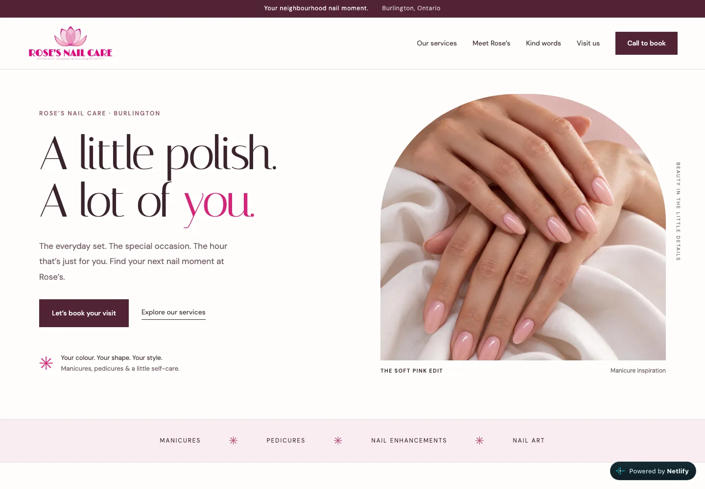
Fine serif typography, blush tones and an arched manicure image create a calm salon identity. The page pairs that visual softness with clear service categories, opening hours and a call-to-book path.
An independent website concept. No commission, business approval or measured results are claimed.
THE MOBILE EXPERIENCE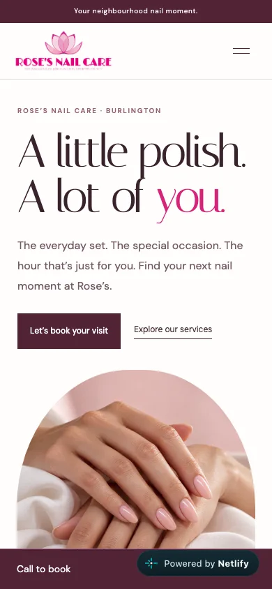
A CLOSER LOOK
In the details.
01
A distinctive first impression
Italiana headlines and restrained pink accents frame a large, arched image in the opening composition.
02
Services without the guesswork
Manicures, pedicures, enhancements and nail art each have a concise description and enquiry link.
03
A clear route to a visit
The salon’s contact and visiting information sit together, with FAQs supporting common questions.